Survey of London Monograph 17, County Hall. Originally published by Guild & School of Handicraft, London, 1991.
This free content was digitised by double rekeying. All rights reserved.
'The final design', in Survey of London Monograph 17, County Hall, ed. Hermione Hobhouse (London, 1991), British History Online https://prod.british-history.ac.uk/survey-london/bk17/pp26-48 [accessed 3 April 2025].
'The final design', in Survey of London Monograph 17, County Hall. Edited by Hermione Hobhouse (London, 1991), British History Online, accessed April 3, 2025, https://prod.british-history.ac.uk/survey-london/bk17/pp26-48.
"The final design". Survey of London Monograph 17, County Hall. Ed. Hermione Hobhouse (London, 1991), British History Online. Web. 3 April 2025. https://prod.british-history.ac.uk/survey-london/bk17/pp26-48.
In this section
CHAPTER IV. The Final Design
The Assessors (Plate 3d) presented their final report on the competition to the Establishment Committee on 28 January 1908. The drawings for the twenty-three final stage designs were exhibited in the Medical Examination Hall on the Victoria Embankment. A good deal of professional and public comment followed, as was to be expected for what the Building News called 'the most important competition since the Law Courts ... on one of the finest sites now available in Europe'. (fn. 1) The unsuccessful entries deserve study, not least because their authors included some of the most famous names in the profession, and one critic declared that there was 'finer architecture amongst [them] than can be recognised' in Knott's scheme. (fn. 2) In fact, some of their ideas were to appear in the final design for County Hall, including some elements from the first stage designs.
The Competition Entries
The Instructions to Competing Architects set out the main requirements of the brief, and in addition the competitors were provided with a plan of the site, incorporating a sketch plan of the first floor showing the allocation of accommodation as suggested by the Architect's Department (fig. 4). A series of Replies to Competing Architects amplified these (see Appendix I). (fn. 3)
The competitors must also have been aware of Riley's sketch design (Plate 3c), which had been published in 1905, and which more than one commentator thought had induced most of the competitors to add 'cupolas, towers and such features'. (fn. 4) Taken together with the prominence of the site and the scale of the plan, Riley's grandiose perspective must have gone far to convince competitors that a building of civic splendour rather than municipal utility was required. Certainly, they do not seem to have taken too seriously the Municipal Reform Party's intention, if they won the election, to reduce expenditure on the building by 40 per cent – from the £850,000 to £500,000. (fn. 5) London as the head of empire and the world's great city was a common image at the time, and few can have thought that such a city would not look for the very finest of buildings for its administrative headquarters.
From the limited number of competition plans available today – generally only ground and first-floor plans – it seems that hardly anybody questioned the suggested planning of the building. Competitors concerned themselves instead with circulation and architectural style, which goes a long way to explain the similarity of so many of the designs.
Much of what we know about the competition drawings we owe to Alexander Koch (1848–1911), who had worked in Semper's office, studied in Berlin and practised in Zurich before coming to London in 1885. He published Academy Architecture and Architecture Review and later British Competitions in Architecture. His volume on County Hall illustrated the twenty-three final entries in the competition and six others. Koch himself entered the competition but was not selected for the second stage. (fn. 6)
The plan provided by the LCC gave a suggested layout of cross blocks and internal courts adapted to the irregularly-shaped site. It clearly influenced the competitors, many of whom opted for a similar solution, incorporating a central north-south corridor connecting the cross blocks. One, that of Alexander Marshall Mackenzie (1847–1933), was boomerang-shaped with a stepped-back crescent towards the river, another, that of the well-established Edinburgh commercial architect, G. Washington Browne (1853–1939), had an apsidal northern end, while maintaining a frontage parallel with the river (fig. 7b). Some competitors provided a major feature on the Belvedere Road frontage. Arthur & Walter Reid & East designed a deep crescent with a parade for the use of Members and a high tower reminiscent of those being built on town halls in Germany at the time. (fn. 7)
The Council Chamber was placed by most competitors in a central position, sometimes with an external feature to mark its situation. The Anglo-French firm of R. A. Hinds & Jules Deperthes identified the Members' area by a higher mansard roof with a small dome at each corner (fig. 9a). Other competitors, such as the Scot, Hippolyte J. Blanc (1844–1917), well-known for his Edinburgh churches, crowned the Chamber with a dome.
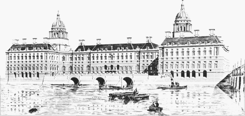
a Design by E. L. Lutyens. River-front elevation showing the three dock entrances. The arcades on either side enclosed the public embankment walk under the wings of County Hall
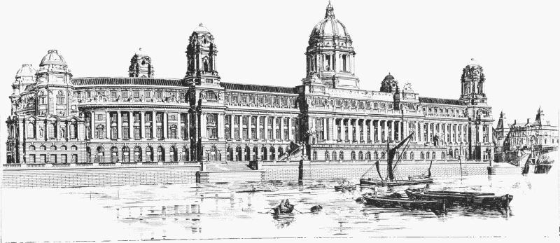
b Design by G. Washington Browne. Perspective view from the north-west showing the apsidal northern end and the dome over the Council Chamber
Fig. 7. Competition Designs for County Hall, 1908
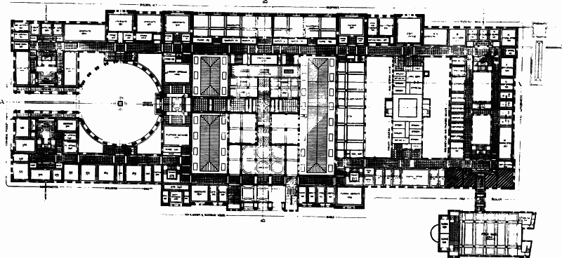
a Design by H. T. Hare. Ground-Floor plan showing the Members' Entrance from Westminster Bridge Road to the large interior courtyard, the entrance from Belvedere Road (with a staircase up to the Council Chamber on the floor above), and the almostdetached Public Hall. The shape and position of Hare's courtyard doubtless influenced Knott's own, revised, design for a Members' Courtyard
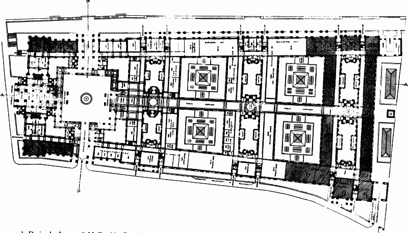
b Design by Jemmet & McCombie. Ground-Floor plan showing the carriage entrance leading from Belvedere Road into a large square 'Members' Courtyard'. The carriage entrance is flanked by covered passages for pedestrians, an arrangement afterwards adopted by Knott for his own Carriage Drive from Westminster Bridge Road
Fig. 8. Competition Designs for County Hall, 1908: Plans. The hatching indicated the allocation of space to different Departments
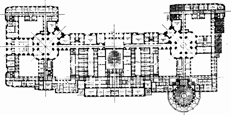
c Design by E.L. Lutyens. Principal-Floor plan, showing the long transverse corridor (linking the North and South Halls, under the two domes), the central Council Chamber, and the Public Hall at the north end of Belvedere Road
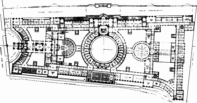
d Design by Warwick & Hall. Principal-Floor plan, showing the entrance from the Westminster Bridge Road via a 'Central Hall' to the horseshoe-shaped Council Chamber. A tall campanile was placed over the 'Central Hall' and a lower tower, crowned with a dome, over the staircase in the centre of the river front. To the north of the great central light-well, ringed with offices, a circular Members' Library balanced the Council Chamber on the south, while the Public Hall was accommodated in the central portion of the Belvedere Road front.
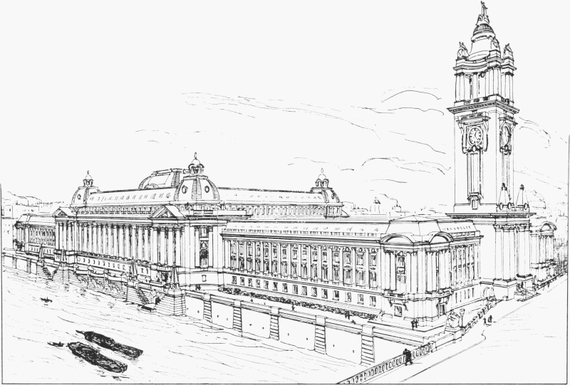
a Design by Hinds & Deperthes, 1907. Perspective view from the south-west. The Members' accommodation was grouped below the mansard roof
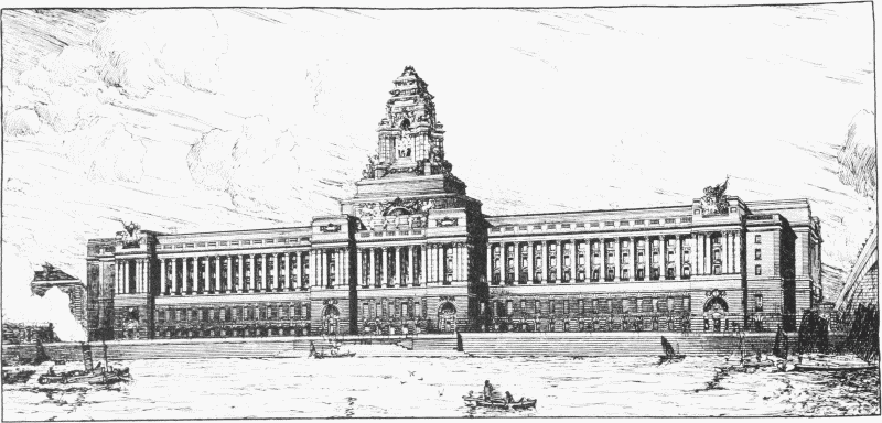
b Design by Russell & Cooper, 1908. Perspective view across the River Thames
Fig. 9. Competition Designs for County Hall, 1907–8
Lutyens, indeed, provided domes at either end of an axial corridor which linked the Members' Library and the approach to the Public Hall with a central Council Chamber (figs 7a, 8c). These twin domes, closely modelled on those at Greenwich, rose out of the octagonal halls, which were the main organizational element of his plan. They provided a link between brick upper storeys and the heavy rusticated stone levels below. Some thought that he had not done enough building on a large scale to justify inclusion in the list. His design, on the other hand, expensive as it undoubtedly would have been to build, showed a better integration of plan and elevation than most of the others. Lutyens' failure to secure the commission, which he saw as an important part of the 'high game', was a source of real chagrin to him – 'All my nine months' work is lost ... All my little bits of work seem dull'. (fn. 8)
The various entrances required for Members, public and staff, were treated by competitors in a wide variety of ways. Some, like E. W. Mountford, John Belcher, and R. Frank Atkinson, placed the main entrance on the east with a grand parade for Members into the Council Chamber. Others, like the veteran town hall architect, Henry T. Hare (1861–1921), provided a Members' Entrance on the Westminster Bridge Road, a feature commended by the Building News as a plan of 'great dignity ... with its main entrance beneath a boldly designed archway' (figs 8a, 17).
Hare, trained in Yorkshire and Paris, had already designed a number of municipal buildings, including those at Oxford and Southend. He had been invited into the second stage, justifying 'his reputation by submitting a design of great simplicity and dignity, combined with originality'. The Building News went on to say that it had been 'rumoured that this design was one which nearly achieved selection, and, as an addition to the architectural beauties of London, it is to be regretted that it did not do so'. (fn. 9) Its plan was developed from the south, where a carriage entrance on Westminster Bridge Road led into a circular courtyard and Members' Entrance. Hare did not continue his series of important rooms farther north on to Holloways' land. There is an impressive clarity about the scheme, and some clever planning. To gain two handsomely proportioned courts surrounded by well-lit offices, he set his cross-blocks with single-sided corridors backto-back. Hare must indeed have been very near to victory with this scheme, for it is hard to believe that it was a more expensive proposition than Knott's, and his elevations were considerably plainer. The scheme was to have its effect on the final version of Knott's design.
The question of natural lighting posed considerable problems for the competitors, in view of the large number of corridors and circulation spaces. Corridors with rooms on one side only provided better and more agreeable lighting, but double-sided corridors with borrowed lighting were more economical, and most competitors included both types in their solutions.
One of the requirements was for an assembly hall for public use, and therefore, like a theatre or concert hall, subject to the LCC's own licensing regulations. This was treated in a number of ways: one or two schemes integrated it within the main block, but in many it was detached from the building, often placed on the northern end of the Belvedere Road front, as the LCC plan had suggested, thus taking advantage of the broader northern dimension of the site. Lutyens, together with Flockhart, Hare, Ernest George, and Mountford, left it as a slightly unhappy projection, which might have looked rather curious when built.
As Halsey Ricardo observed in the Architectural Review, little advantage was taken of the grandeur of the riverside site – only one competitor, Matthew J. Dawson (1875– 1943), is known to have provided a Main Entrance from the river (fig. 23). This had a carriage road on the embankment, below a loggia, from which a gallery and vestibule led to the grand staircase and thence to the Council Chamber and Assembly Hall on the Principal Floor. (fn. 10) Lutyens' scheme had three dock entrances under the building, other schemes had somewhat ambiguous arches under the embankment, or, like those of S. B. Russell & Edwin Cooper (fig. 9b), and Knott himself, contained elevations which implied that river craft could land passengers on steps leading to the terrace.
Different aspects of the internal planning exercised different contemporary critics, and because it was a building of such a composite nature, being both grand Hôtel de Ville and workaday office block, an effective critique was almost as much of a problem for the critic, as was the design for the competitor. Thus Lutyens was praised by the Builder for 'a very symmetrical and architecturally effective interior', but he was criticized for providing a circuit of 160 feet for Members returning to the Council Chamber from the voting lobbies. (fn. 11) Both Hare and Warwick & Hall were generally praised for their planning, and both were 'tipped' as winners in press gossip. (fn. 12)
There was some surprise that the latter partnership, also specialists in town hall design, was not invited directly into the second stage of the competition; yet they won their way through by producing a plan of some sophistication (fig. 8d). Beginning with a crescent carriage entrance facing Westminster Bridge Road, their plan develops northwards into the Council Chamber, Members' rooms organized around a circular court, and a Members' Library in a corresponding position to the Council Chamber.
There were press criticisms of the way in which some first stage schemes had been rejected, and the Builder reproduced that by Lanchester & Rickards with the frank comment that it was better than at least one of the second stage designs (fig. 10). (fn. 13)
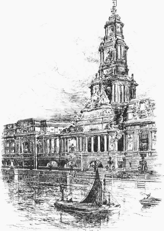
Fig. 10. Lanchester & Rickards' competition design for County Hall, 1907. Perspective view, drawn by E. A. Rickards, of the central portion of the river front
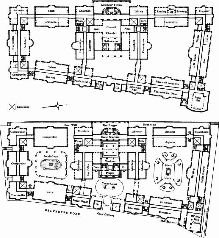
Fig. 11. Salmon, Son & Gillespie's competition design for County Hall, 1907. Ground-Floor (below) and Principal-Floor plans, showing the blocks linked at first-floor level and the generous landscaped courtyards. Ch. Chemist; K Keeper; P Porter; W Watchman
Despite the prohibition of perspectives, most of the professional criticism, as well as the comment from the general public, was based as much on style and the view from the river as on sophisticated questions of internal planning. However, two, at least, of the more avant-garde designs did break away from the mechanical and somewhat unimaginative layout of the 'Suggested Plan'. Both Adrian Gilbert Scott (1882–1963) and Salmon, Son & Gillespie of Glasgow, rejected the central block flanked by two courtyards either side for a more open arrangement. 'The main idea', wrote Scott, in the Builder, 'was to take advantage of the size of the site, provide fine courtyards, avoiding, of course, all well-holes ... inexcusable on a site of this magnitude'. (fn. 14) His scheme provided a grand arched entrance from the Westminster Bridge Road leading into the south court, with a comparable space on the north of the Council Chamber block. Salmon's plan (fig. 11) was one of the 'freest' and most original of those plans which have survived. Entered through a 'Great Gateway' from Belvedere Road, the site was ringed with a series of individual blocks linked at and above the Principal-Floor level, each one dedicated to a different department. A central E-shaped block with the base resting on the embankment contained the Council Chamber flanked by Members' accommodation and committee rooms. Most of the embankment front was given over to Members, but Architect, Clerk and Engineer were also to enjoy river-views. In addition, the central courts contained gardens and fountains. This ingenious and adaptable scheme was elevated in what reads today as Post-Modern avant la lettre, but which may at the time have had overtones of industrial dwellings: a series of gables complete with dormer windows and the occasional 'Queen Anne' pepper-pot, were presided over by a highly ornamented version of a Wren City steeple (Plate 4b). (fn. 15) Scott's skyline was dramatically plain and simple, depending for effect on a row of gigantic chimney-stacks and dormers above an impressive leaded roof (Plate 4c). His elevation to the Thames was necessarily high to 'tell across the river', but equally without central emphasis; a lower but still substantial 'loggia' on the river front provided accommodation for Members. C. H. Reilly of Liverpool University also designed a lower block on the river front (fig. 20), with the deliberate intention of making the building more impressive from the other side of the river, as well as providing details of a more sympathetic scale than a single monolithic building would have necessitated. (fn. 16)
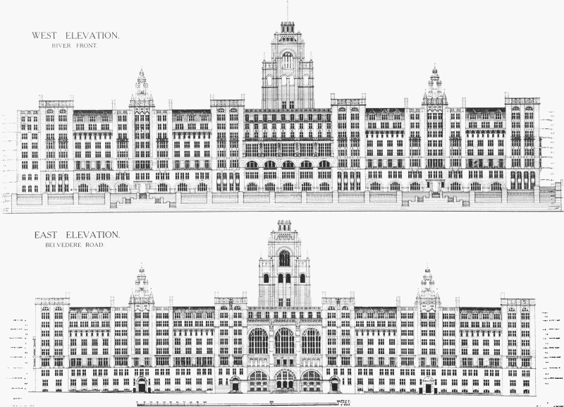
Fig. 12. Nicholson & Corlette's competition design for County Hall, 1908. Elevations. The three tall round-headed windows over the main entrance on the Belvedere Road front would have lit a three-storey 'County Hall' (Public Hall) on the Principal Floor. The tower was raised over the principal staircase and contained offices
That Riley's 'sketch' elevation (Plate 3c) had been taken seriously by many of the competitors is clearly shown by the preponderance of classical designs with one or more domes. These varied from the 'simple and charming design' by Thomas Davison to the lofty and characteristically overblown one set between four lantern towers from Clyde Young & W. Poley. Even Stanley Peach, better known for his power stations, followed the Riley format, and provided a Capitol-like design. (fn. 17)
However, not all the competitors were seduced. The detailed but repetitive, almost curtain-wall, treatment of (Sir Charles) Nicholson & Corlette was criticized as unsuccessful Gothic, 'mixing Elizabethan and even commonplace Renaissance detail' (fig. 12). (fn. 18) Frank Atkinson's 'immense central tower reminiscent of the Palais de Justice at Brussels' brought a flavour of the Beaux Arts training to the competition, (fn. 19) as did that of Lanchester & Rickards, while Russell & Cooper's scheme presaged their monumental Port of London Authority building in Trinity Square. H. Percy Adams & C. H. Holden, well-known for their hospital designs, produced an interesting plan with a large number of courtyards – though not the twentytwo 'well-holes' held up for censure by A. G. Scott (fn. 20) – and an elegant stripped classical façade with two towers, which foreshadow that of the London University Senate House (Plate 4a). (fn. 21)
The Prize-winning Design
Ralph Knott's scheme stands out amongst the others for its relative simplicity. In the words of the Architect & Contract Reporter, he was the only finalist who entirely omitted 'any attempt at grand halls or staircases or fine architectural effect, such as were suggested by the typical plan supplied'. (fn. 22) It is notable that Knott, who had seen plenty of opulence in Webb's office, was among the first to produce designs which modified the English Renaissance in such a way that it conformed more with what Inigo Jones would have called 'masculine' architecture. Here was a design which managed to unite interior with exterior to a high degree, while using the great size of the building for quietly dramatic purposes.
Knott's plan was extremely straightforward; a central block flanked by courtyards, then by transverse east-west blocks with central corridors and rooms on either side, two further courtyards, and finally by single-sided ranges at the north and south of the building (fig. 13). There was an entrance from Westminster Bridge Road, and a modest one on the north side, but the main axis was east-west through the building. On the river front the main feature was a massive five-bay open arcade between full height rusticated blocks (fig. 5). This projected over a public embankment walk with a flight of steps leading down to the water. The Belvedere Road frontage was dominated by a deep crescent, almost entirely occupied by a circular block containing the Public Hall. The main entrance was behind this building under a porte-cochère. Knott's skyline lacked domes, or the Germanic watch-towers of Warwick & Hall and Hinds & Deperthes, the only features being an extremely modest flèche, two stories of dormers, and a very uncompromising row of chimneys. The Builder would rather have liked a dome – 'one does feel that a grand and monumental architectural character, with something of the dignity which a central feature like a dome can impart, even when not carried to an unreasonable and unpractical height, is what might be looked for'. (fn. 23) However, in Halsey Ricardo's words, the new building was 'to be mainly a beehive and a workshop rather than a palace – Somerset House should be the model rather than the Houses of Parliament'. (fn. 24)
The Building News found little real enthusiasm for the scheme, commending its simplicity but criticizing the double-sided corridors, and the planning of the Ayes and Noes Lobbies, and the lavatories and messenger's boxes. It recognized the convenience of the siting of the Public Hall, since it could be so easily omitted from the final scheme. The 'numerous dormers' would have 'a fidgety effect, by no means redeemed by the tall chimneys. But of all these things', it concluded, 'our readers can judge for themselves'. (fn. 25)
Alexander Koch, in an open letter to the Members of the LCC, was as critical of the interior as of the exterior:
Considering cheapness to be the first consideration, I will not dispute great merits in the chosen design, but ... this cheapness has been obtained especially by interior arrangements which cannot be tolerated for a moment, and will certainly have to be altered. (fn. 26)
Amongst other improvements, he instanced the need for better corridors, a proper Members' Terrace 'in connection with the Restaurant', and a grand Members' Entrance from Westminster Bridge Road. It is interesting to see how many of his suggestions were later incorporated in the final designs.
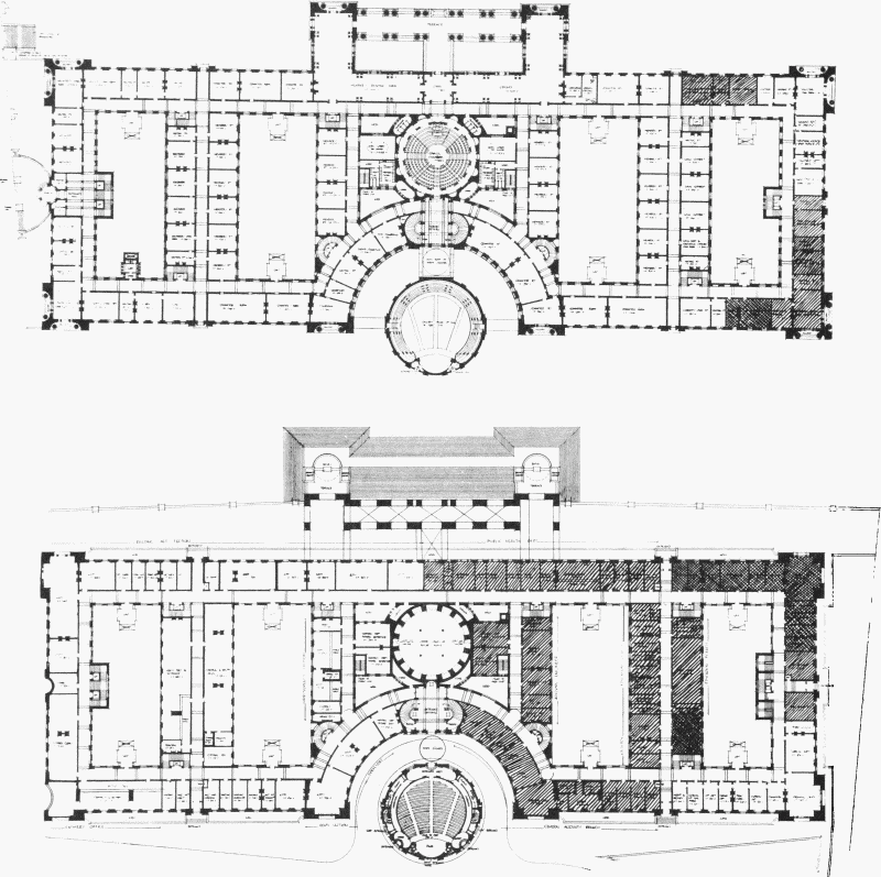
Fig. 13. Ralph Knott's winning design for County Hall, 1908. Plans of the Ground Floor (below) and Principal Floor showing the symmetrical layout with equal-sized courts. The hatching indicated the allocation of space to different Departments, which were intended to be 'stacked' vertically, the Chief Officers being on the Principal Floor. There were entrances on all sides of the building, including one at the north end, two from the embankment, and an impressive one for pedestrians on the Westminster Bridge Road front. On the Belvedere Road front a porte-cochère between the main building and the detached circular Public Hall gave access to both. The Members' accommodation was located in the centre of the Prinicpal Floor. The riverside portico contained their Reading Room and Library, and enclosed a Members' Terrace under an arcade. Private rooms for the Chairman and other dignitaries were placed in the crescent, overlooking the Public Hall
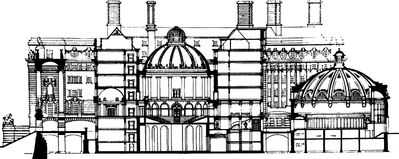
Fig. 14. Ralph Knott's winning design for County Hall, 1908. Section, looking north, showing, from left to right, the embankment, the arcade under the portico, the Council Chamber and the Public Hall
The architectural plainness of the scheme would, of course, have commended it to the new Municipal Reform administration, with its anxiety not to be seen to be extravagant. The very absence of domes and other features which critics looked for to grace such an important site was desirable from the Council's point of view. Knott's plan owed more than that of many other competitors to the plan circulated, being, if possible, even simpler. There were, however, two other elements in his plan which would have been appreciated by the Assessors. One was the possibility of detaching the contentious Public Hall, something which other competitors had also provided for, the other was that nothing of significance stood on the northern part of the site, to be occupied by Holloways for some time to come.
A question of a more personal nature was raised about Knott's involvement with Aston Webb, from whose office he took leave of absence in June 1907 to work on the County Hall competition, returning after the second stage submission on 30 December 1907. It is sometimes said that Webb was reluctant to award Knott first place, fearing that this would be interpreted as an act of favouritism, but there is no evidence of any such reluctance. In fact, Webb agreed to take on the job of third Assessor fully aware that two of the finalists were currently or had been assistants of his. But the letter he wrote at the time to the Clerk, disclaiming any prior knowledge of their designs, shows he was sensitive on this issue:
I may say to prevent any misunderstanding that I am informed that two of my old assistants, one still with me, have been successful in the Preliminary Competition but that their designs were not prepared in my Office nor have I seen them or been consulted about them in any way, indeed I have not seen any set of the designs successful or otherwise. (fn. 27)
More interesting questions are raised by the economical nature of Knott's scheme. Its simplicity was perhaps no coincidence. At least one architectural periodical said quite baldly that the reason was Knott's being in a 'position to obtain the best information as to the working of the Council's business'. (fn. 28)
Almost certainly this is an allusion to Knott's association with E. Stone Collins, his partner in the Bristol and Malvern libraries competitions, who was then employed as an assistant in Riley's own department. The two had been at school together, though Collins was the older by four years, and they were fellow students at the Architectural Association. After training with George Kenyon and E. W. Mountford, Collins joined the LCC's Architect's Department, where he worked on the Totterdown estate. Knott and Collins wanted to enter the County Hall competition together, but Riley had ruled that no-one in his department should work on it without first relinquishing his post, and the newly married Collins was understandably reluctant to give up a permanent appointment.
Thus Knott entered the competition on his own and Collins retained his position with the LCC. When questioned about a connexion with Knott which had possibly influenced the outcome of the competition, Collins feigned innocence. They had jointly entered competitions before, he said, but when the conditions for County Hall were issued they had decided that as he was an officer in Riley's department, it was not advisable for him to be associated with Knott in the competition – though presumably this did not preclude him from giving Knott hints or advice. Collins then fell ill with appendicitis and was laid up for two months, and it was while he was on sick leave, late in July 1907, that he became directly involved with Knott's design. In his own words:
Mr Knott showed me his scheme which was well advanced, but informed me the strain of the work was beginning to tell on him and it would be necessary to obtain assistance to do the repetition work & drawing out of some of the upper floor plans and I assisted him to complete the drawings in my spare time, my services were given gratuitously as a friend. (fn. 29) (fn. a)
Twenty years later Collins gave the Clerk a differently turned version of these events:
Knott showed me his scheme, with which I was greatly impressed, [and] he expressed grave doubts as to whether he could get the drawings done in time and asked me if I could give him a hand. I had 4 weeks holiday leave due and decided to spend that time helping him.
Before sending in the drawings we discussed whether they should be sent in under the joint names which Knott was willing to do. The inception of the scheme being entirely Knott's, I decided it was not fair to expose him to the risk of disqualification owing to my position on the Staff ... Knott then promised to take me into Partnership should anything eventuate. (fn. 31)
Although in both versions Collins is careful to limit his role to that of helping to draw out an already matured scheme, as a First Class Assistant in the Constructional Division he had more than a vague idea of what Council and Committee were thinking. The head of this division was Percy Ginham, who was running the County Hall business day-to-day, being briefed by Riley and preparing reports for him to present to Committee. It is difficult to imagine that any other competitor can have had an equal understanding of the drastically altered wants of the Council after March 1907. The Knott-Collins connexion was to be a source of friction with Riley, who referred to Collins subsequently, perhaps ironically, as Knott's 'chief draughtsman'. (fn. 32)
Knott's Office
Shortly after winning the County Hall competition Knott set up an office in Adelphi Terrace House (Nos. 1–3 Robert Street), where he was soon joined by Collins, who resigned from the LCC at the end of April 1908. This was effectively a partnership, although not formalized as such in law until 1919, and from 1908 non County-Hall work emanating from the office was credited jointly to Knott and Collins. At County Hall the situation was different. There Knott's locus standi was personal, as the 'Selected Architect', and Collins, though he was deeply involved with the County Hall work, had no official standing, even after 1919. When Knott died in 1929, before County Hall was finished, Collins, as his partner and long-time colleague, was the obvious person to succeed him. But he had to be appointed to the post; there was no automatic right of succession to Knott's role inhering in the firm.
Up to the time of Knott's death the signed drawings for County Hall carry his signature, over the designation 'Selected Architect'; after 1929 the drawings are signed E. Stone Collins, above the name 'Knott & Collins'.
The scale of the design drawings required the services of a number of draughtsmen, and by the summer of 1911 there were at least seven assistants working in the office (fig. 15). (fn. 33) The most distinguished were Arthur Gordon Shoosmith (1888–1974) and Julian Leathart (1891–1978). Shoosmith, a pupil of Goodhart Rendel and Burnett, went on to become Lutyens's representative at New Delhi between 1920 and 1931. (fn. 34) Leathart, who had studied under Beresford Pite, joined the office about 1909, having previously worked for W. D. Caröe, and Nicholson & Corlette. He left Knott in 1915 and after completing his war service worked for Morley Horder and then for Henry Tanner, before setting up his own practice in 1921 with another of Knott's assistants, William Frazer Granger (1888–1969). In 1921 Granger was still working for Knott on County Hall. The Leathart and Granger practice was noted for its 'kinemas' and schools.
Though Knott's career was almost entirely absorbed by the County Hall project, he did carry out a number of smaller jobs, and in 1913 he and Collins found the time to enter the Devonport Guildhall competition. Their entry gained third place, but the standard of draughtsmanship attracted criticism. (fn. 35) Among Knott's smaller works were a house in a modified County Hall style in Upper Grosvenor Street, Mayfair (1908–9), and Mallord House, Chelsea, completed in 1911. The Chelsea house, designed for the painter, Cecil Hunt, shows Knott working entirely successfully in a sort of free-style architecture, a brick and tile building containing one or two exaggerated classical elements. It is frequently true that small buildings bring out the best in architects, but these two projects in particular show in Knott an architectural skill which is evident only in one or two parts of County Hall, such as the Members' Entrance and Carriage Drive. (fn. b)
All through its construction, County Hall involved two architectural offices, Knott's office and one representing the LCC. The relations between them were involved and need some clarification. Knott was the 'Selected Architect', Riley the Council's 'Official Architect', and their duties were set out in the Rules of the Competition. Further complication was added by the fact that Riley held a personal appointment for his work on County Hall, distinct from his post as Architect to the Council, which was to mean that when he reached the official retiring age as a Council employee, he could continue as architect for County Hall. (fn. 36) (fn. c)

Fig. 15. Postcard sent by Julian R. Leathart in July 1911 to his colleagues in
Knott's office, which gives
some clues to the number and
identity of Knott's assistants:
D. Dennington;
H. unknown;
G. W. F. Granger;
Sgn. unknown;
Shoo. A. Shoosmith;
T. F. T. unknown.

shows Leathart himself and 'Old Collard'
If the economical nature of Knott's scheme commended itself to those who were representing a frugal administration in County Hall, the relationship between Riley and any successful competitor must have also been significant. As Riley had reminded the Establishment Committee in 1907, he was to have considerable control of the building's design:
It may not be realised that the conditions make it quite explicit that I am to interpret for the architect who may be selected the planning and internal arrangement of the building, and ... it was the main object of the Establishment Committee who recommended the competition, that an endeavour should be made to unearth a genius who would be able to elevate and ornament a building of these pretensions. (fn. 37)
This role would be easier with a younger man, without his own standing and reputation. Since by the second stage even the anonymous first stage competitors would have been known by name, if not by design, to the Assessors, the temptation to Riley to avoid experts on municipal buildings, like Warwick & Hall or H. T. Hare, would have been very great.
Changes to Knott's Design
The Assessors' Criticisms
The Assessors had made it clear in their Report that they anticipated that changes would be needed:

a Elevation to the Thames, showing the central square portico and the steps down to the river

b Elevation to Belvedere Road, with the quasi-detached Public Hall set in a recess
Fig. 16. Ralph Knott's winning design for County Hall, 1908
As is usual in a competition for a building of this magnitude, all the designs (which after all can be, at this stage, little more than preliminary or sketch designs) show certain discrepancies and irregularities, sometimes in plan, sometimes in elevation ... and any of the designs ... would need modification before being executed ... we wish to record our opinion that the great projection of the centre portion of the river front requires modification, and that the fine flight of steps into the river .. should be omitted. (fn. 38)
One can only assume that in Knott's design they felt they had discovered, in Halsey Ricardo's phrase, 'the best conception of how to treat the problem given'. In 1909 Riley told J. D. Gilbert that the winning design was 'a masterly one, owing chiefly to its great simplicity'. (fn. 39) If so, the simplicity was perhaps deceptive, and later changes which were forced upon it largely sacrificed that quality.
Halsey Ricardo had concluded that Knott's design could only be called a beginning, 'a counter wherewith to win the competition ... we know ... that it must be redesigned'. He went on to point out how futile such a proceeding made the expense of the competition, in words that must have been welcome to Riley:
an enormous set of conditions, regulations, statements about areas, and the rest of it, is compiled, a suggested plan ... and an actual expenditure of £7,000 in cash ... in order to discover talent. To this expense must be added the expenditure of the ... unsuccessful competitors, which ... comes to close upon £10,000. Had the Council been strong enough to have selected an architect at the first instance, all this labour, this anguish of invention, and ... this expense – had been saved. (fn. 40)
In fact, a considerable further 'anguish of invention'
was to take place before the Council could approve a final
design. Inevitably, it was a long and tedious process,
played out as it was between the Selected and Official
Architects, the other Assessors, Aston Webb and the
increasingly ill and literally jaundiced Norman Shaw, and
finally, of course, the Members. Of these the most important was the Chairman of the Establishment Committee,
R. C. Norman (1873–1963). Norman (Plate 46c) was an
LCC member from 1907 to 1922, Chairman of the Council
in 1918–19, and, according to his political opponent Percy
Harris, 'by far the ablest man on the Municipal Reformers'
side ... always a difficult man to reply to, because he never
left a weak spot in his armour'. (fn. 41) Brother of the Governor
of the Bank of England, Montagu Norman (1871–1950),
he was nephew to the conservationist and well-known
antiquarian, Philip Norman (1842–1931), also connected
with the LCC through his editorship of the Survey of
London. Norman took over the Chairmanship of the Establishment Committee from March 1908 to March 1910
and remained on the Committee until 1913. He had not
thought the Belvedere Road site a good buy, either financially or in terms of the prestige of its location. Nor did he
like the fact that compulsory purchase had been resorted
to. In his opinion it would have been better for the Council
to have bought land in the area by agreement and as it
became available, building the county offices piece by
piece as need arose. But, as he pointed out, these were
questions that 'should have been raised three years ago'. (fn. 42)
Once convinced of the quality of Knott's design, Norman
was to become one of its principal defenders. (fn. d)
The changes canvassed, both to the external features and the plans, were very extensive, but the very reticence of the scheme presented problems for the Assessors, who considered themselves charged with cutting it down to fit the new Council's brief. Figures 18 and 19 show the way in which Knott's original concept went through several metamorphoses to emerge a very different building from that which won the competition.
Knott proposed a rectangular plan, more or less symmetrical about its short axis, except for the entrance at Westminster Bridge Road. The most striking feature of the design (figs 13, 16) was his treatment of the Belvedere Road front. Here Knott scooped out a great crescent embracing in its centre a free-standing, shallow-domed, circular Public Hall projecting forward of the front line of the building. This was the assembly hall called for by the Instructions. Between the hall and the crescent a semicircular carriage drive, guarded by wrought-iron gates under ornamental arches, led to a porte-cochère and the principal entrance. In the view of the Builder this was the one point of Knott's design 'which, architecturally considered, may be called a stroke of genius'. (fn. 44) The principal feature on the river front was a massive loggia rising straight from the embankment's edge, and comprising two full-height pavilions joined by an open colonnade of coupled columns. From this loggia down into the river ran the contentious flight of steps which the Assessors in their report said should be done away with. There was not a great deal of floor area within the pavilions as planned – on the Principal Floor they held about half the Members' Library and Reading Room. What they did do, architecturally speaking – as did the Public Hall with its projection eastward from the Belvedere Road front – was to lengthen the building along its short, east-west axis. Knott had chosen this axis for the alignment of all his main spaces, but there was not really room for the many functions required along this route without the employment of some such device. Many competitors, Lutyens and Hare among them, had produced plans organized along the north-south axis, relieving the monotony of that long route with varied spaces, but also 'trespassing' on to the Holloway site. Knott's solution was in fact a very clever one: he could not only fit in a generously sweeping carriage drive which penetrated to the heart of the building, but he could still give comfortable room to the Council Chamber which stood at the centre of his plan. It was all very compact planning, and was given due expression in elevation, as recognized by the Architect & Contract Reporter:
Mr Knott is undoubtedly aesthetically right in the elaboration he has bestowed upon the centre of his river front and of his Belvedere Road elevation as compared with the almost brusque simplicity of his wings; for the former expresses the existence of the council chamber and the administrative part of the Council's functions, and the latter that the building is mainly the workshop of a numerous staff of employés. (fn. 45)
Development of the Design
What such a plan could not tolerate was a lot of whittling down in the length of its principal but shorter axis, and unfortunately this is what it was immediately to suffer. For if the Assessors had felt that the riverside steps were excessive, the Establishment Committee were just as certain that the Public Hall was unwanted, a piece of information Knott received officially on his first visit to see Riley and Norman after winning the competition. During this meeting, on 7 February 1908, Norman told him that there was not the slightest chance of the Public Hall ever being wanted, and that it would strengthen the Committee's hand if they could prepare a plan showing that a building on the site without Holloway's land could accommodate the present staff. Riley made a number of suggestions: that the Council Chamber be moved nearer to Westminster Bridge Road, that it ought to be horseshoe shaped rather than round, and that the whole plan ought to be wedge-shaped, with the eastern front following the line of Belvedere Road, and the Westminster Bridge Road front having similar angles with both long façades. Knott was given a new schedule of accommodation, and, in Riley's words, 'agreed to take the new schedule and plan away to prepare some sketches and see me again in four days time'. (fn. 46) Even if forewarned by Collins, Knott must have felt keenly the rapid transition he had made from fêted artist to servant of the LCC.
In these circumstances, when the brief was being radically altered, major changes in the design of the building were being proposed, and in the light of the Assessors' reference to his winning project as a 'sketch design', it is understandable that Knott felt at liberty to re-design the elevations as well as the plans. At any rate he did so, and difficulties were to arise between himself and the Assessors during the next few years as a result.
Already by the middle of February 1908 the plan was considerably changed, and Knott had added a crescent entrance on the Westminster Bridge Road front. As Riley pointed out, this was 'nearly the same as that shewn on Warwick & Hall's plan' (fig. 8d), and the charge of plagiarism might be levelled at him if this change became known, but Knott responded that 'the disposition to drop the public hall on the Belvedere Road front had robbed him of the reason for such a feature'. While plagiarism was obviously not something Riley wished to encourage, he thought a few hints from other plans would not be amiss, and concluded their second meeting by advising Knott to have a look at the schemes of Hare (fig. 8a), Flockhart, and Jemmett & McCombie (fig. 8b), where he might pick up some useful bits of planning. (fn. 47)
Later the same month Riley began his long series of direct interventions, presenting Knott with a plan that his department had prepared which showed a building extending not only over the competition site, but also over the Works Department land to the north. (fn. 48) Nothing came of Riley's suggestion, which was obviously strategic and not a proposal intended for immediate execution, but it does raise again the question of building style.
None of the competitors had thought their plans through as extendible, in this or any other direction, even though it was well known that the LCC owned the land north of Holloways, and experience had shown that local authorities had a constantly growing need for accommodation. Had they done so, it is possible that one of them might have thought of producing a more flexible, or at least a less monumental building, to which extensions could be made. The competitors' choice of style is largely explained by the fact that the LCC, like all local government bodies of the time, was expected to prefer monumental architecture. Within the LCC were some of the finest 'Free Style' architects of their generation, and the suspicion must remain that had Riley's department been given the job, perhaps without Shaw's help, they could have produced a fine building and one capable of later extension.
At the same time that Knott was revising his plan, a report by Knott and Riley was before the Finance and Establishment Committees with suggestions for possible savings on the building. On the assumption that the prizewinning scheme could be built for the original sum, it was thought that £48,000 could be saved by omitting the Public Hall, and £128,000 by erecting only so much of the building as would reach the boundary of Holloway's site, leaving an expenditure of £674,000. (fn. 49) These attempts at saving money continued for some time. It was hoped that by widening Belvedere Road, and at the same time moving it eastward and enlarging the Council's site, it would be possible to omit Holloway's site from the calculations. At this point the Committee still believed that Holloways might release the Council from their obligation to proceed with the purchase of their lease, and even when it became clear, in March 1908, that they would not do so, the Council decided to lease the site back to them for a number of years. They would build only three quarters of the scheme immediately, 'finishing off the ... building short of the premises of Holloway Brothers so that it will not present an unfinished and distasteful appearance'. (fn. 50) In the event County Hall stood lop-sided on the South Bank for eleven years (Plate 10b).
By 2 July 1908, Knott and Riley were ready to present the Committee with a new plan and elevation, and a perspective by Harold Wyllie (Plate 5a, fig. 18b). They reported that the modifications to the elevations were those proposed by the Assessors:
The central projecting features have been reduced, and are now connected by a segmental shaped colonnade which forms a covered terrace for the use of members approached from rooms devoted to their use on the Principal Floor.
The large flight of steps leading from the embankment to the river front of the central bay of the design has been omitted and substituted therefor are the slight projecting segmental bay and flight of steps parallel to the embankment which were adopted by the Committee on the 21st May, 1908. (fn. 51)
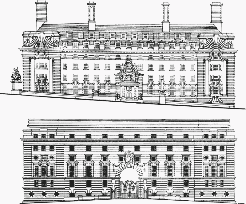
Fig. 17. Competition elevations for the Westminster Bridge Road front of County Hall, 1908, by Ralph Knott (above) and H. T. Hare (below)
An attic storey had also been added to the central section, and the much criticized turret or flèche had gone.
These changes were approved by Council in mid-July, but not without debate and minor dissent. The Rev. F. Hastings had thought the earlier design dull and considered the new attempt no better. He had looked at Wyllie's picture of the new façade in the lobby, and thought that if the splendidly drawn barges and the colouring were taken away, the design itself was 'very poor'. Though many Members thought the building less than inspired, Norman, as Chairman of the Establishment Committee, urged the Members not to turn themselves into a 'Committee of Taste'. (fn. 52)
The new design was criticized in a letter to The Times, in which the pseudonymous correspondent claimed that the altered design, published in July, had occasioned 'much painful surprise and consternation' in art circles. Knott's design had been hailed on all sides as promising, and worthy of the long line of monumental architecture, of noble bridges and palatial buildings, dignifying the Thames from Greenwich to Westminster:
Now, it appears, ... the river frontage of the selected design is to be shorn of its characteristic motif – the very architectural effect by which ... the successful competitor triumphantly carried off the blue ribbon of the concours ..
As proposed to be altered the design gives place to effects suggestive of two linked cotton-mills with an apologetic architectural feature, apparently appliqué, to form something central ... A more disastrous result of meddling interference, frustrating an art work of national importance for the frontage of our noble river, can hardly be conceived. (fn. 53)
Shaw was upset by this letter, as was Norman, who proposed to write to The Times in his own and the Committee's defence. Riley told Knott that he had 'personally received a strong hint to advise [him] to stick to the main features of the successful scheme', and that if he did it might be possible to forestall further correspondence to The Times. (fn. 54) This presented some difficulties since so much of Knott's work had been criticized by the Assessors.
It is true that changes had been demanded, and possibly an unreasonable number of them. Yet Knott himself had gone far beyond the modifications asked for by the Assessors in altering his design, in many cases entirely on his own initiative. Thus in August 1908 he presented a scheme which had two crescents, one on each long façade, and a dreadfully pinched system of circulation, described by Riley as 'reducing the already narrow site on the waist to something verging on an impossibility' (fig. 18c). (fn. 55)
Riley then suggested – and had a drawing ready to illustrate the idea – that Knott's original Belvedere Road feature of a circular hall sitting in a semi-circular recess be shifted to the river front, where the hall would serve as a Council Chamber. (fn. 56) He was later to claim that he always considered this part of the winning design to be its most convincing element, and certainly the one which had influenced his vote. (fn. 57) When Knott said he liked the idea but could not see how to treat the elevation of the Chamber, Riley produced a photograph of the baroque church of the Madonna di Vico in Piemonte as an exemplar. Knott remained unconvinced, however, and Riley then suggested a crescent on the river front, but without any buildings in it. This idea had emanated from Shaw, as Knott was embarrassed to learn after he had disparaged it. (fn. 58) (fn. e)
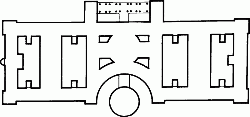
a Knott's winning competition plan, 1908, with the circular Public Hall in a recess on the Belvedere Road, and the square portico on the river
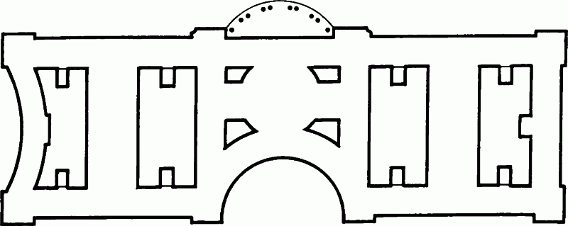
b The amended plan approved by the Council in July 1908, incorporating changes asked for by the Assessors and the Establishment Committee, which included the omission of the Hall and the reduction of the portico

c The 'waisted' plan proposed by Knott in August 1908. The dotted circle indicates the position for the Council Chamber suggested by Riley
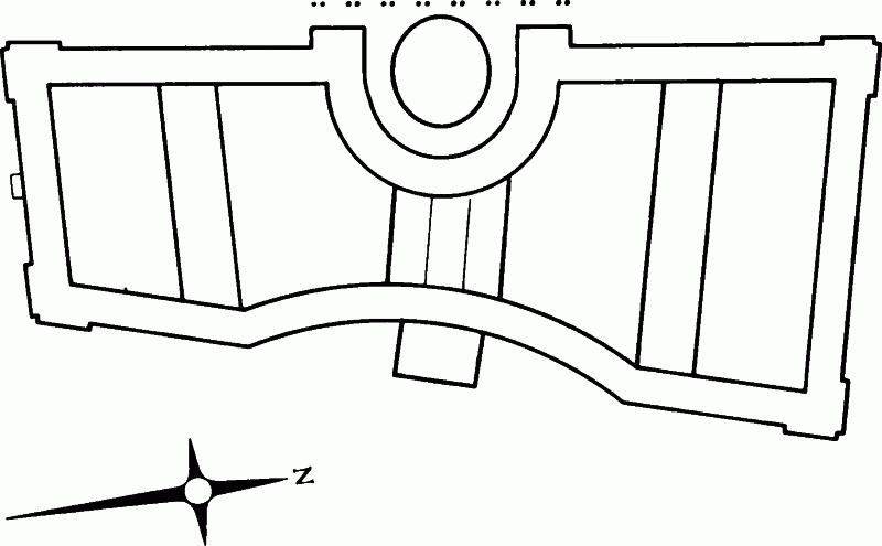
d Knott's 'fan-shaped' scheme of January 1909, showing the Council Chamber on the river front, and the porte-cochère entrance on the Belvedere Road front
Fig. 18. The development of the plan of County Hall, 1908–9
Despite the doubts expressed at this October meeting, Knott re-worked his scheme to accommodate the Council Chamber situated in a riverside recess. On 5 January 1909 he presented Riley with a complete set of floor plans except for the basements, which were intended largely for storage. These plans have not survived, but Riley made extensive notes on the scheme, shown in outline in figure 18d. The revised plan had so many entrances and features that it made impossible demands on the site: a shallow recess on the Belvedere Road front remained to contain the main entrance, which was housed behind a portecochère of 'open columns' forty-three feet high; there was a pedestrian entrance in Westminster Bridge Road, while on the river front was the additional 'very deep recess' some 137 feet across and 103 feet deep. In this recess Knott had placed an elliptical Council Chamber and over it the Members' Library, located, however, as Riley observed, some five floors above the rest of the Members' accommodation. A row of coupled columns across the front of the Chamber and recess provided a Members' Terrace some seventeen feet in width. The circulation for Members was not well planned, while the sheer bulk of the Chamber made it impossible to light the surrounding rooms properly. Riley also had some criticism of the 'radial' or 'fan-shaped' arrangement of the cross-blocks, the irregular courtyards, and the lack of light. (fn. 60)
The plan of the County Hall as eventually built seems to have emerged from the meeting of the three Assessors held, without Knott, on 2 February 1909, to consider Knott's plans in the light of whether they complied 'reasonably with the elevations and plans as they intended they should be modified when the award was made'. Under discussion was Knott's revised scheme (fig. 18d). The radial plan was particularly disliked, Shaw going so far as to say afterwards that had it featured in Knott's competition entry he would not have won through to the second stage. The Assessors felt that if the crescent was to be moved from the Belvedere Road front to the river side then a screen of columns should be carried across the front of it, to preserve the 'rectangular disposition of the building on the river front'. They also wanted the Council Chamber to go back 'practically to the axial position on the plan', and the courts 'squared up'. Shaw and Webb both 'expressed the strongest possible desire' for a Members' Entrance in Westminster Bridge Road. (fn. 61)
These views were put to Knott two days later, when the main points of discussion were the siting of the Council Chamber and the treatment of the river-front. It was now Riley's turn to be embarrassed, for Knott had produced a clay model of Riley's own suggestion for placing the Chamber in the crescent, and was, in Riley's words, 'somewhat tenacious' in his defence of this arrangement. But the meeting ended with an agreement to take the Chamber out of the crescent. It was also agreed that the crescent itself would be widened and raised and the roof above it lifted up two storeys, the intention being to 'make the heightened central composition unmistakeably the feature of the river front'. (fn. 62)
Throughout February and March 1909 these and other points were discussed at meetings involving all the protagonists, in combinations of almost Machiavellian complexity. The Assessors met privately, and together with Knott; the Royal Academicians met individually with Riley, sometimes relaying messages through Percy Ginham; and Norman, as Chairman of the Establishment Committee, had separate meetings with both Knott and Riley. (fn. 63)
A plan was produced by Riley to demonstrate the Assessors' ideas, and this was discussed with Knott, though Riley was not allowed to show it to the Establishment Committee. (fn. 64) This 'Assessors' plan' (fig. 19a) shows the essential features of County Hall as built, though with two equal-sized courtyards to the south of the centrally placed Council Chamber and a crescent screened by a single row of coupled columns along the river front. Knott made a stand on the question of the 'southern courtyard', where he wanted a smaller court immediately behind the Westminster Bridge Road front to make room for a large Members' Courtyard to the north, but he accepted in principle the suggestions for the treatment of the river front. (fn. 65)
As to the treatment of the colonnade itself there was some disagreement. Knott himself wanted a double colonnade of coupled columns, thus re-instating in a slightly different form a feature which was present in his original design. His two rows of columns were set twenty feet apart, making a covered walkway or Members' Terrace between the pavilions at the ends of the crescent. Shaw did not like this: apart from the question of light he thought the effect in perspective would be a 'jumble' of columns. Webb would have preferred two rows of single columns. Even less did Shaw like Knott's alternative, which dispensed with one of the two screens but doubled up the columns into groups of four. Tempering his criticism with some judicious flattery, Shaw told Riley that the crescent was 'a most delightful piece of design and entirely Mr. Knott's!' which it would be 'a pity' – even 'a sin' – to hide behind a screen of columns. (fn. 66) At his own Piccadilly Hotel the purpose of the screen of columns had been only to conceal 'a mass of cheap work'. (fn. 67)
Another area of disagreement between Knott and the Assessors was the design of the 'angle blocks', that is the pavilions at the corners of the building, where Knott had replaced the original columns with 'massive rustications'. Apart from being 'most unfair' to the Assessors, Shaw felt this change had been 'all in the wrong direction', and he urged the reinstatement of the original, 'very masterly', design. (fn. 68)
Neither the design of the angle blocks nor the exact form of the colonnade had been resolved when the Council was asked on 6 April 1909 to approve the revised treatment of the river front. The drawing presented to the Council (and subsequently reproduced in the Building News) was an elevation, leaving it unclear whether the screen of coupled columns indicated was single or double. (fn. 69) In spite of a protest from the Rev. F. Hastings, who wanted the Council to commission a 'model in a cheap material' before agreeing to any changes, the Council approved the new elevation. (fn. 70) Towards the end of the year, however, a far from cheap ¼-inch scale model (costing £400) was ordered from the well-known sculpture and modelling firm of Mabey to help settle the still unresolved features of the design (Plate 5c). (fn. 71) Knott, meanwhile, was working up a perspective of the river front for exhibition at the Royal Academy, which clearly showed his intended treatment of the double colonnade (Plate 5b). Knott's perspective was reproduced in both the Builder and the Building News in 1910, the latter also publishing a plan in which the Members' Courtyard and the organization of Members' accommodation appear virtually as built (fig. 19b). (fn. 72)
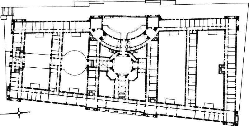
a The Assessors' suggested plan of March 1909, showing the Westminster Bridge Road entrance and Members' Courtyard, and the riverside Crescent screened by a single row of columns
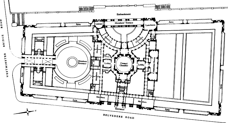
b Knott's plan published in 1910, showing a double row of columns across the Crescent, Carriage Drive and enlarged Members' Courtyard. The planning of the central Section A is shown virtually as built
Fig. 19. The development of the plan of County Hall, 1909–10
Following the delivery of Mabey's model in July 1910 the Establishment Committee was asked to decide on two 'outstanding points' – the design of the 'angle blocks', and the screen of columns across the crescent, both features having been made removable on the model. (fn. 73) Knott's revised treatment of the pavilions was allowed to stand, but the question of the colonnade was a more difficult matter. Discussions, with visits to Mabey's studio to view the model, continued throughout the summer and autumn, culminating in an Assessors' report to the Establishment Committee in October 1910 which suggested either reducing the colonnade to a single screen of columns or omitting it altogether and carrying 'the Order round the segmental crescent'. The Assessors' preference was for leaving out the colonnade as this would give 'a far more valuable architectural treatment and get rid of all objection to the destruction of light'. Knott still favoured the double colonnade, but preferred to lose this feature completely rather than see it reduced. The Assessors called for a new 'part-model' to show the 'architectural treatment' of the crescent without the colonnade. (fn. 74) In April 1911 a photograph of the revised model (Plate 5c) was shown to the Council with a recommendation from the Establishment Committee that the Council should approve the omission 'of the cross colonnade in the centre portion of the river front', and the carrying of the 'order' round the crescent. The Committee reported that the Assessors thought the modified design was 'a considerable improvement on that approved on 6th April 1909'. Knott had acquiesced in the modification, expressing the opinion that the amended design would form 'an entirely satisfactory elevation'. The 1909 design was accordingly rescinded and the new one approved. (fn. 75)
Though 'consequential adjustments' were necessary, the main lines of the County Hall design were at last settled, at least as far as the southern three-quarters of the building were concerned, on which construction had already in fact begun. In its final form the crescent with its attached columns was not unlike C. H. Reilly's unsuccessful entry (fig. 20), published in November 1907, (fn. 76) which Shaw and Riley would have seen at the first stage of the competition. It is said that Reilly was convinced Knott had stolen the design of the crescent from his elevation, and was so outraged he never spoke to Knott again. (fn. 77)
The building which emerged from this long and manyfaceted revision was a more sophisticated and interesting one than Knott's original competition entry (folded drawings A and B between pp. 62–3 and 110–11). The planning, which originally had been very close to the 'suggested plan', had been refined to provide a Members' Entrance and Carriage Drive into the heart of the building, the embankment had been retained, but the Members' Terrace had been set back and a public thoroughfare provided along the river. The residual 'docks', which led Riley to assume that coal would come into the building by barge, (fn. 78) had disappeared, and vehicular access was to be from the northern side of the building. The design of the two fronts of the building had been virtually reversed – the square colonnade which had been the most striking feature on the river front had become the main element on the Belvedere Road front, while the deep circular entrance on the east had been transmuted into the shallower crescent of the river front. The elevation had become plainer and simpler: not only did much of the rich baroque decoration of the original design never materialize (fig. 24) but the pavilions, with the exception of those in the centre, lost their columns. The decision not to build immediately on the northern quarter of the site was to open the way to further variation of the original design in the late 1920s when the northern front was finally put in hand.

Fig. 20. C. H. Reilly's competition design for County Hall. Perspective sketch of May 1907
Early on in his struggles Knott gained an ally in Norman, who began to make frequent visits to Knott's office, where they would discuss the Committee's views and require ments out of Riley's earshot. The two men, only five years apart in age, seem to have formed a friendship outside the LCC job, with Knott spending some time in Norman's country house, Moor Place, at Much Hadham in Hertfordshire. (fn. 79) These informal meetings were an added source of friction with Riley. 'My present impression', he noted in November 1908, 'is that all the matters he [Knott] brings to me have been settled between him & the Chairman of the Establishment Committee before he comes'. (fn. 80) A certain stiffness developed between the two architects, not least because of what Riley must have seen as a vindication of his earlier advice against a competition. As Ricardo had written in his review of the competition, 'the public, ignorant of what architecture really is, naturally underrates the value of experience, and is ready to back youth and liveliness against practice and resource'. (fn. 81) Whether youth and liveliness were not being to a large degree stifled by practice and resource is another question. An equally important point is that all this took time, pushing the start of building work back to a period when it would be seriously affected by economic difficulties in the building trade, and by the First World War.
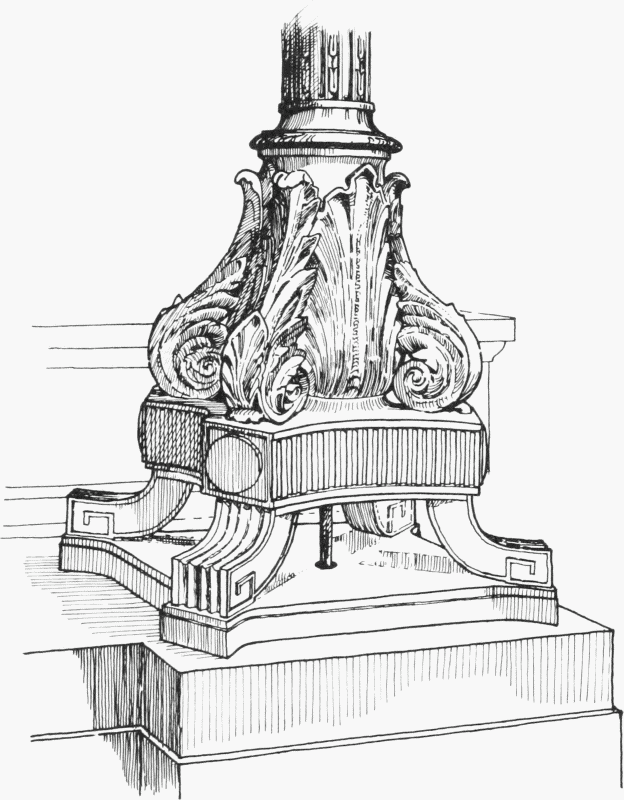
Sketch of the base of one of the bronze lamp-standards on the Ceremonial Stairs which were made by the Bromsgrove Guild